This project is not an actual UX project, but we don't often get an opportunity to showcase the results of our image manipulation projects.
This website underwent a facelift, and we wanted to show a couple of the pages we worked on.
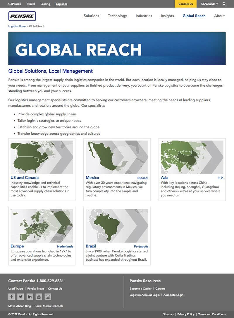
The images were too "busy" with various backgrounds and overlays that did not improve the quality of the photos, and the people/maps were aligned to the left to make room for the chevrons.
The images' quality was inconsistent due to the use of various lighting sources.
Several people's faces were not entirely inside the image.
We wanted to present the results of one of our favorite assignments - simplifying an existing page or website.
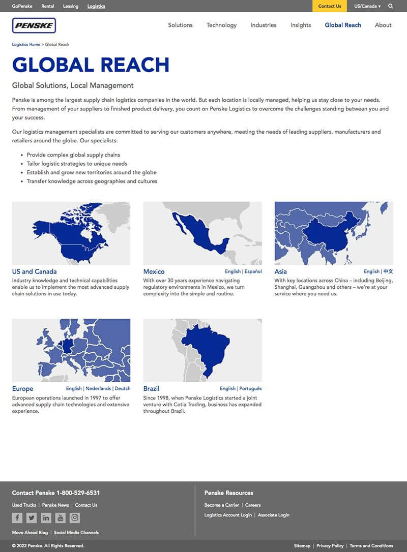
As part of the new page layout, the page width was expanded by 120 pixels, the borders removed, the page header simplified, and some content colors adjusted.
The images were made more comprehensive, and their positioning optimized.
We created new images using the original portrait photos but removed the original background and replaced it with an identical background.
We also centered the person in the picture.
We optimized the skin tone of some people to accommodate the different lighting sources they had been photographed under.
Same page optimizations were done for the Global Reach page, where the map images were also optimized.


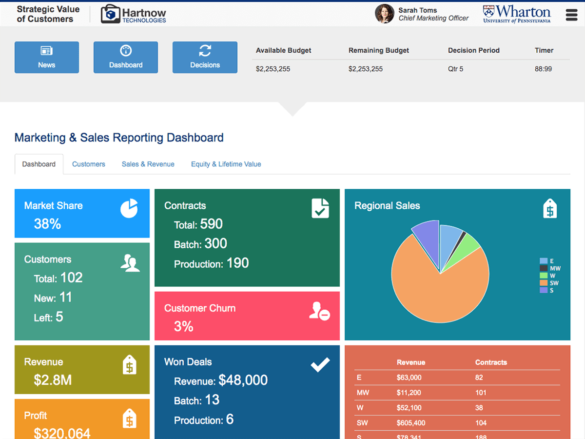
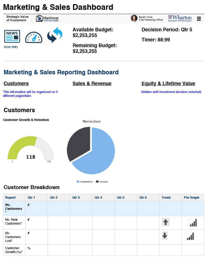
One of the most data-generating business simulation apps used in business classrooms at Wharton University is the Strategic Value of Customers.
The program utilizes the fictitious company Hartnow Technologies which provides nationwide industry-leading 3D printing services.
While the simulation is running, students will manage and react to various transactions and changes in data settings and market changes by constantly adjusting for market trends, rules, tax settings, inflation, customer churn, and several other variables.
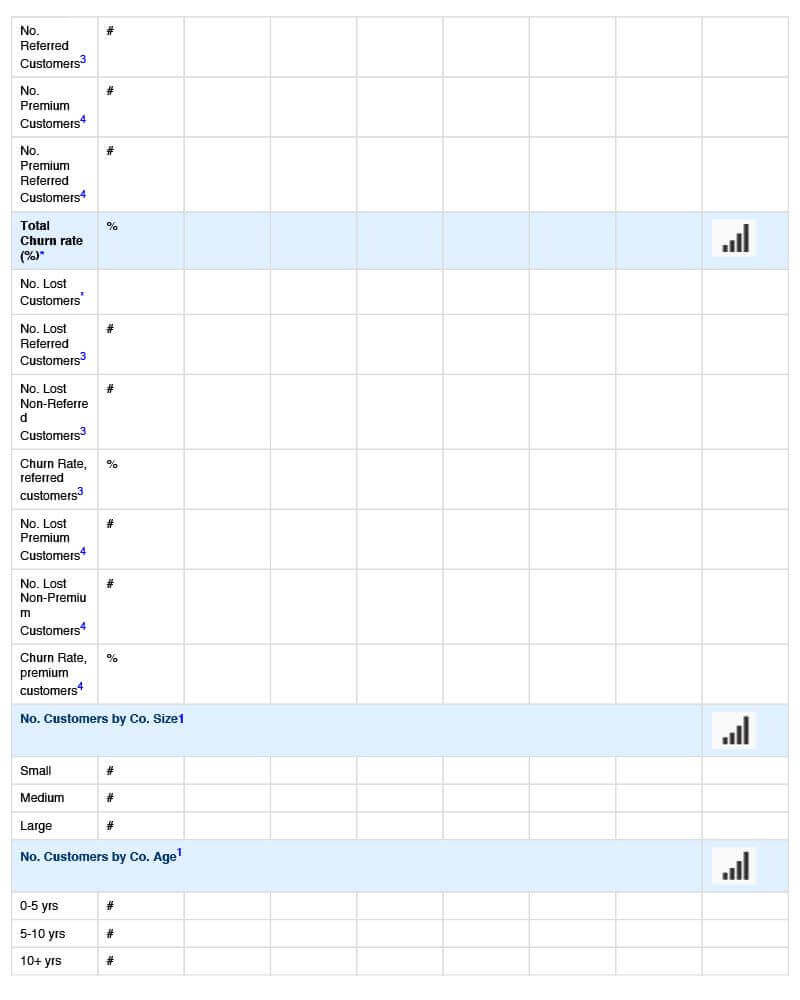
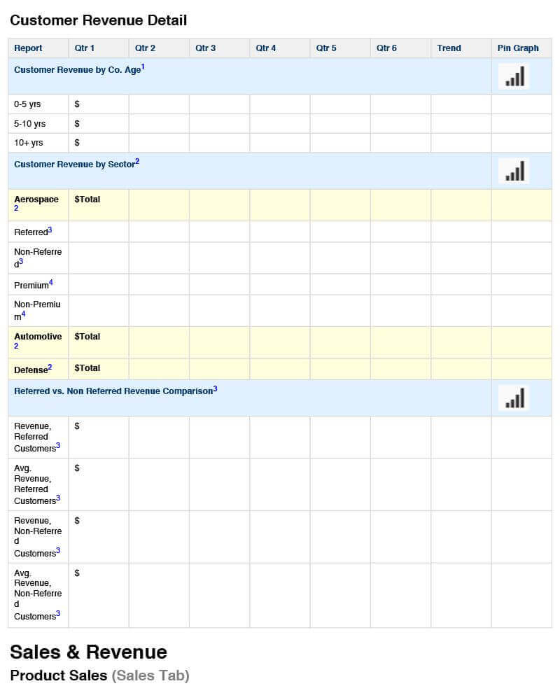
The software creates a massive amount of data accumulated in countless data tables on the students' computers.
The longer the solution was running, the more difficult it became for students and professors to maintain a helpful overview of the accumulated data and make necessary changes.
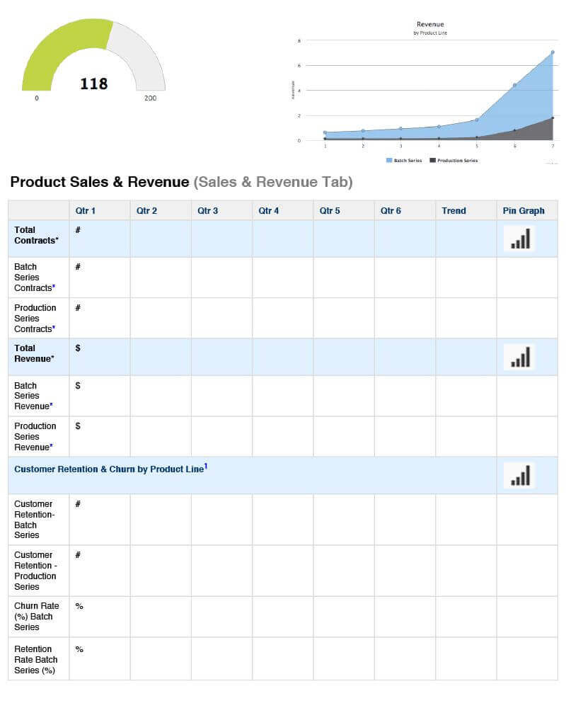
We started with the main problem - finding a better way to view the amount of accumulated data quickly.
Our first step was to generate a table of accumulated values from various data tables and categories for a faster overview.
While that was a good improvement, it was still not as efficient as students and professors had to read through many lines in the data table to make informed decisions.
We took the values from the calculated table and used them on the main page to form a Dashboard with calculated values presented in boxes with various background colors, large fonts, and icons to quickly identify categories and values.
By clicking on a data value in a box, students and professors could jump directly to the raw data and make changes.
These changes would be updated in the main table and on the Dashboard in real time.